League of the America’s Trophies, League of Legends
For 2025, Riot Games merged the North and South regions of their League of Legends esports circuit into a single entity: the League of the Americas. Previously the 2 separate regions had their own brand identities and trophies, but these needed to be merged into a single design that was singular to the new LTA but also tipped a few subtle nods to the originals. We were tasked with creating a design that could be replicated for regional events and also modified for North and South championships as the league progressed throughout their tournament calendar.
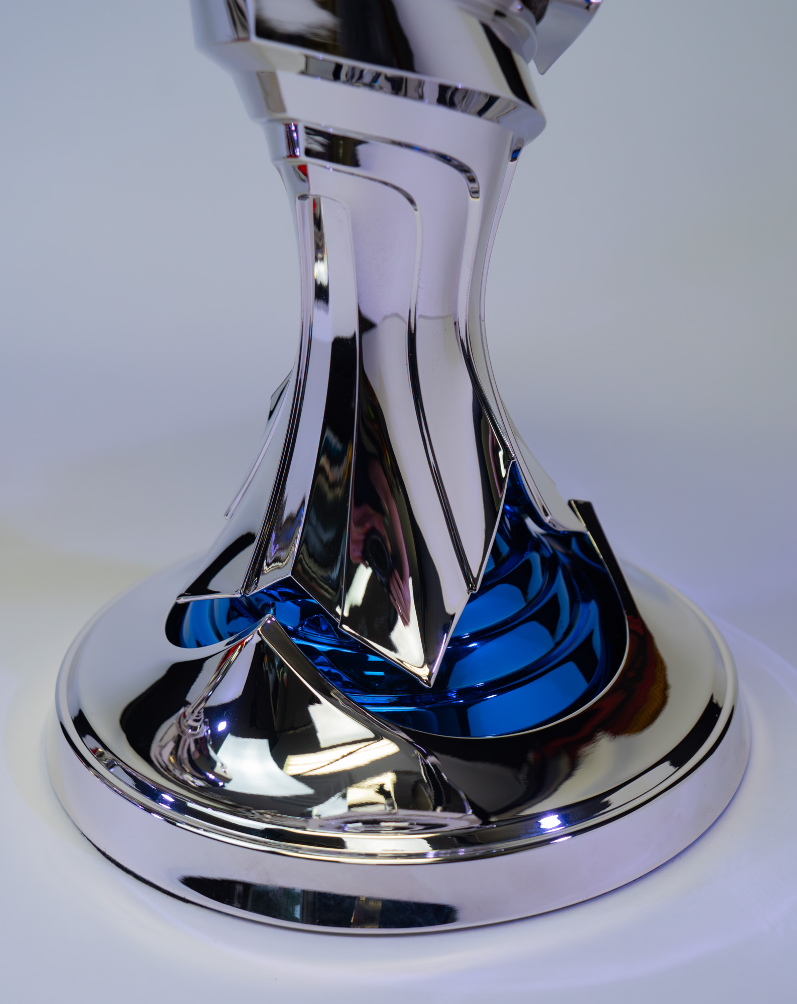
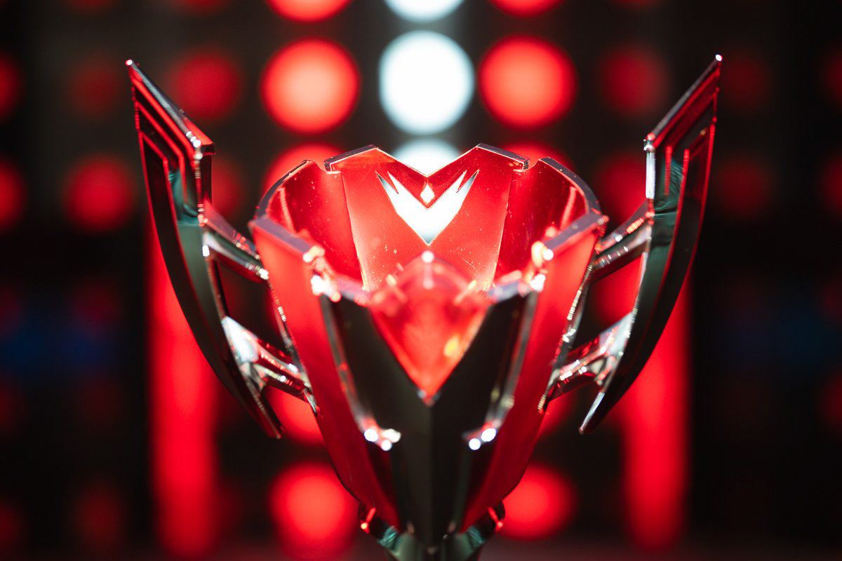
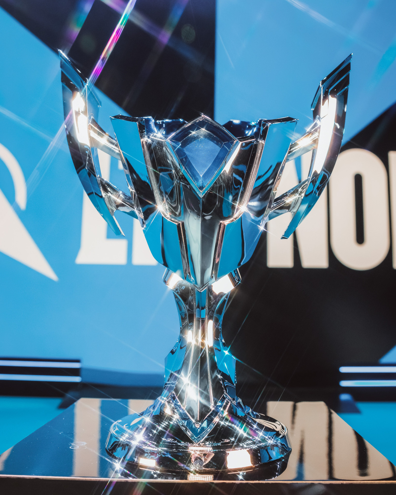
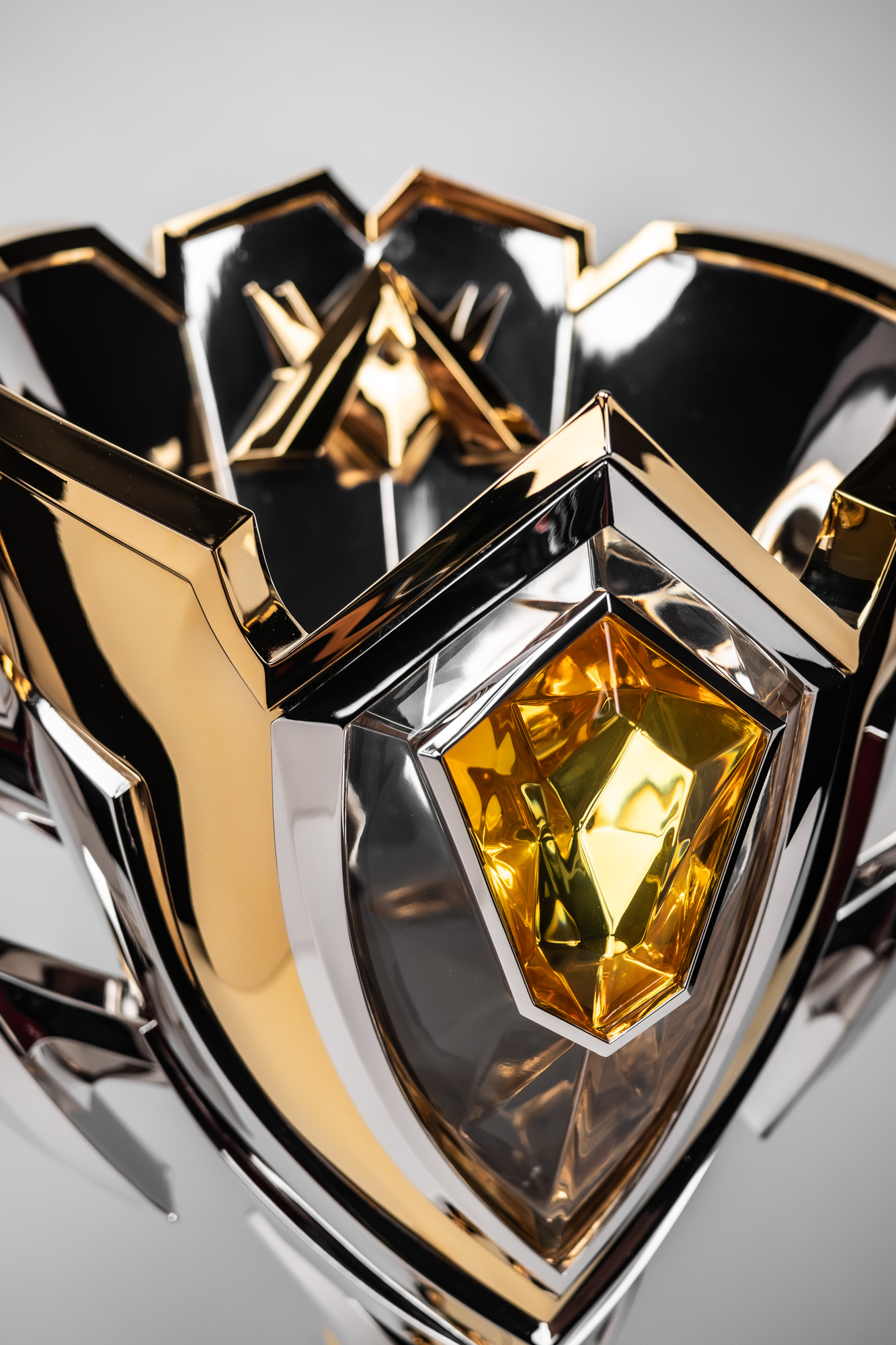
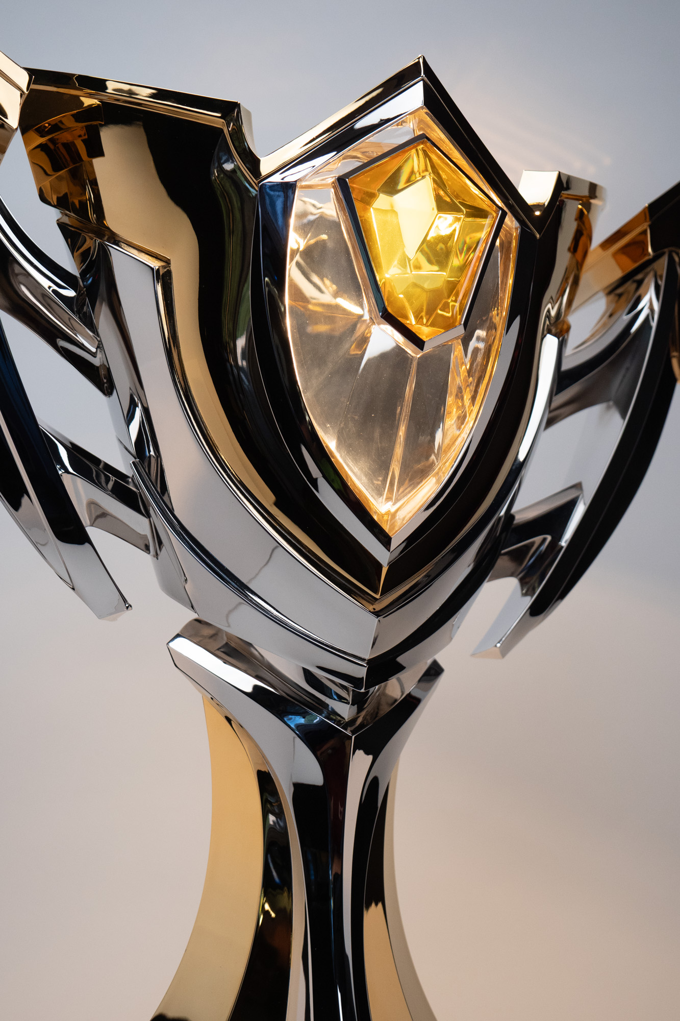
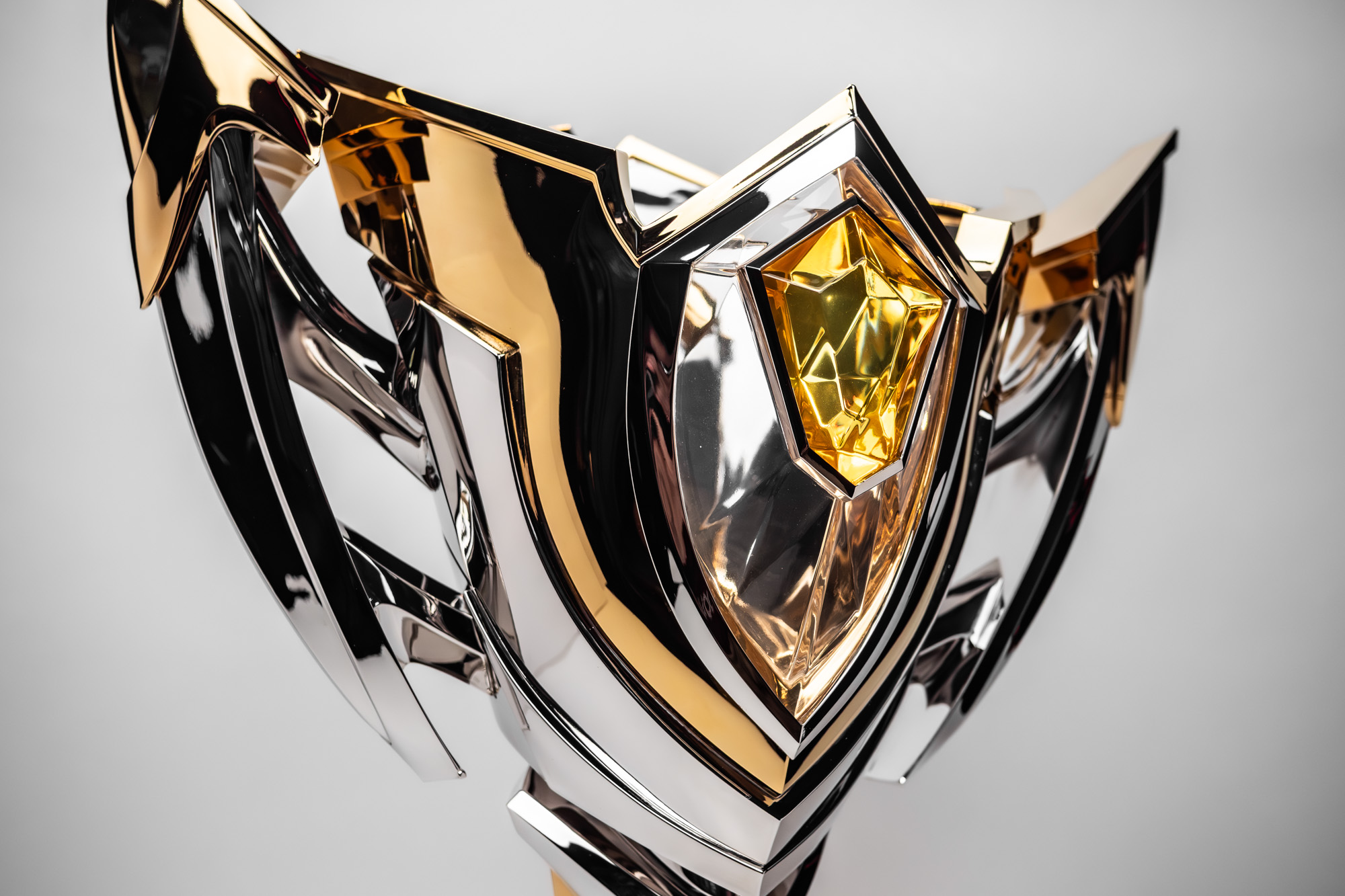
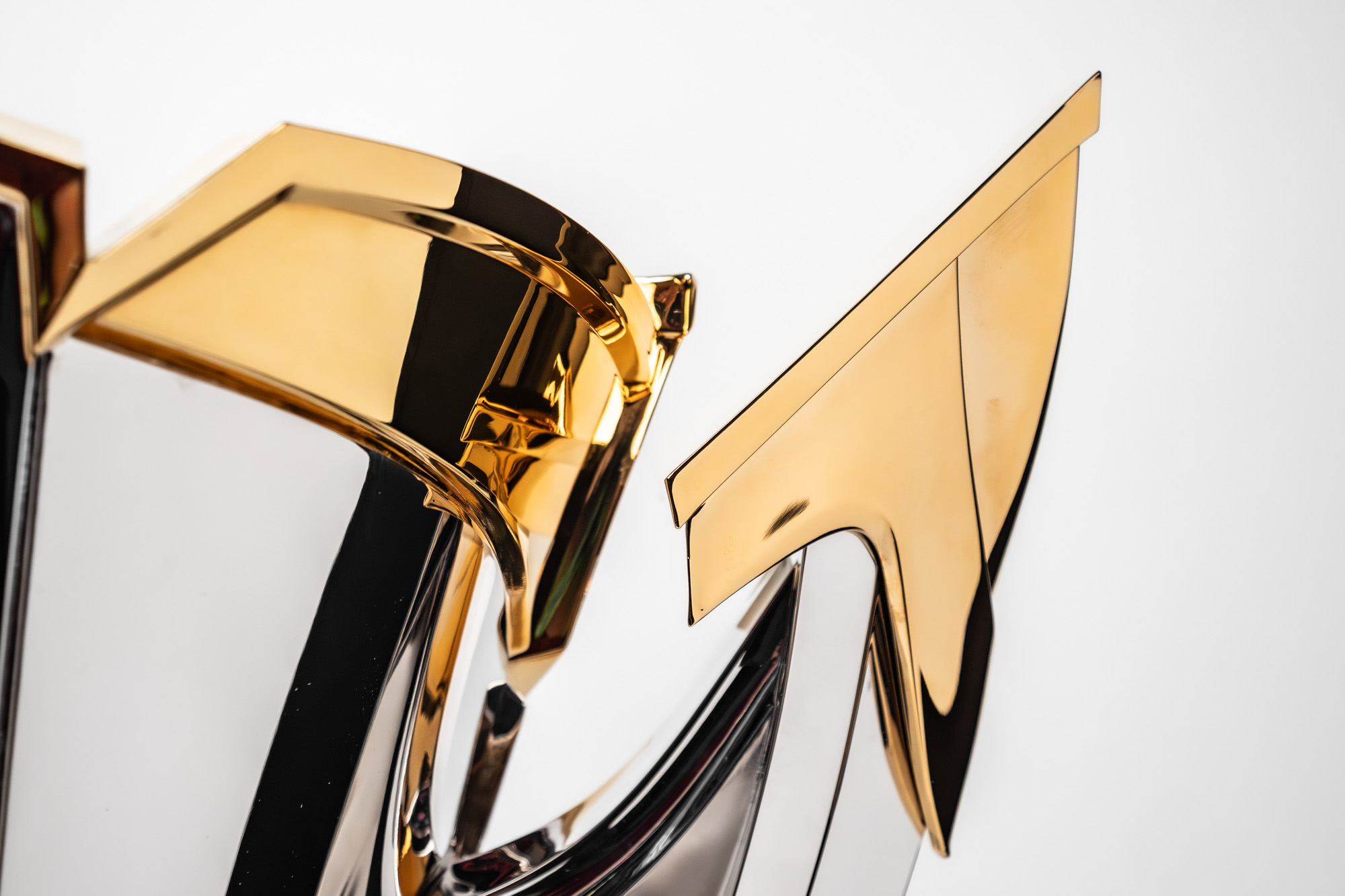
The final design incorporated notes from both the LCS and CBLoL leagues. Log graceful chrome lines and a central gem call back to the LCS, while the sharp uprights and acute angles in the cup and handles echo the CBLoL trophy aesthetics. North and South leagues were also spit into blue and red brand identities. Each cup featured jewel tone accents to compliment the logo window in the back of the design signifying the tournament region. Being regional finals, the blue and red trophies were 18″ in height.
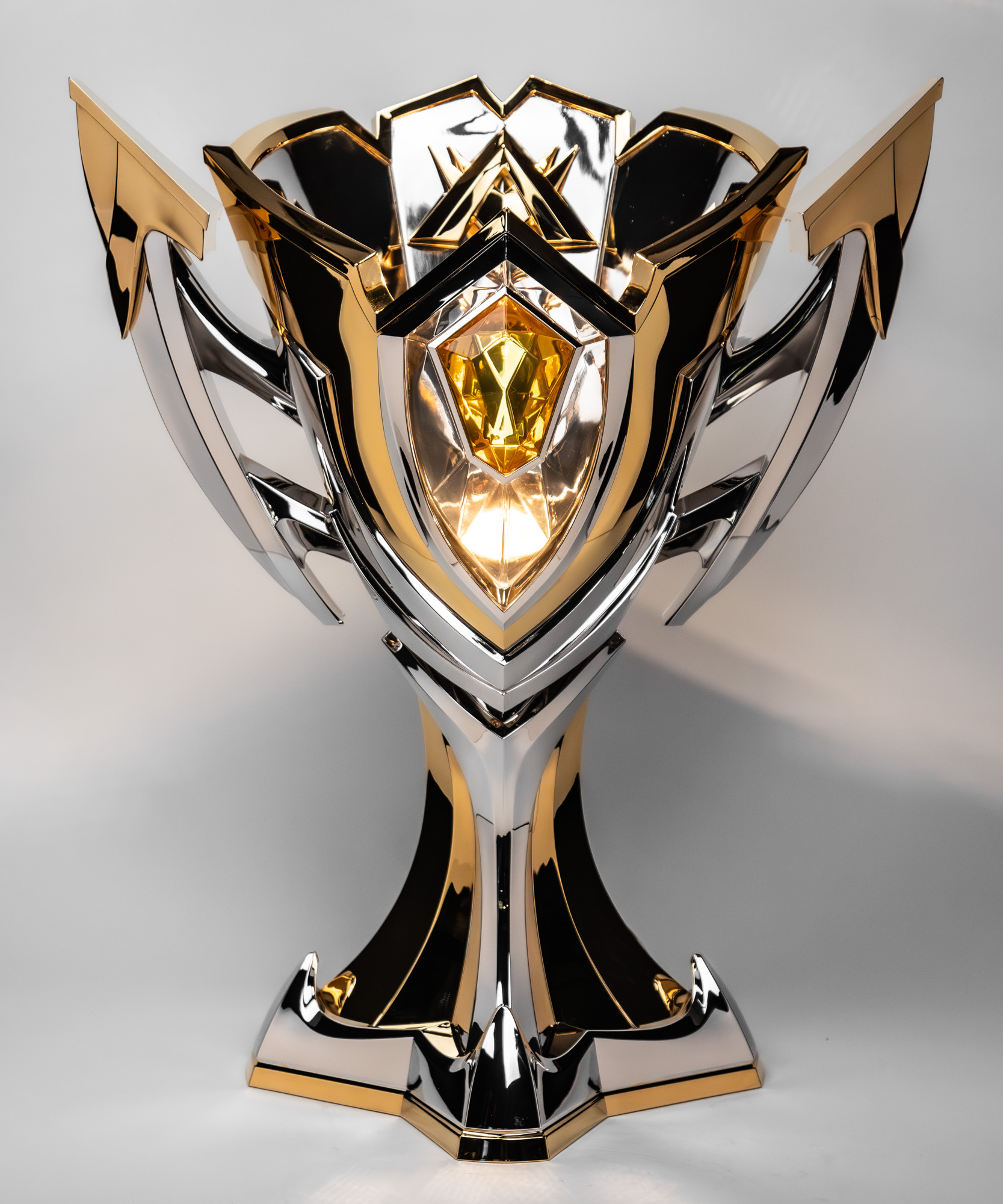
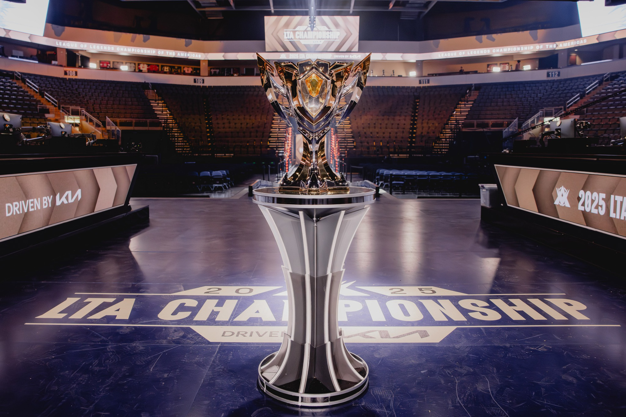
For the league championships, the overall design was elevated in both complexity and scale. A fully new design was created at 26″ tall, featuring a clear front window through which the league logo could be seen on the inside of the cup. Staying separate from the North and South colorways, gold and yellow were selected to represent the top of the league’s ladder. A five-sided base paid homage to the 5 player team who would eventually lift the trophy at year’s end. Weighing in at nearly 30lbs, this piece was definitely one of the biggest in out portfolio and definitely one of the pieces with the most stage presence!


